GRAPHIC DESIGN
Ad Campaigns
Here you can find some of the ad campaigns I have done, showcasing my ability to create engaging and strategically designed marketing materials. Each campaign is tailored to effectively communicate brand messages and drive impact through print, digital, and multimedia platforms.
Digital Design
Here you can find some of the digital designs I have created, including infographics, animations, and UX/UI website designs. Each project is crafted to be visually engaging, informative, and user-friendly, ensuring seamless interaction and strong brand communication across digital platforms.
Print Design
Here you can find some of the print designs I have created, focusing on visually striking layouts, typography, and branding. Each design is crafted to communicate key messages effectively through high-quality, tangible materials like brochures, posters, book covers, and magazines.
Ad Campaigns
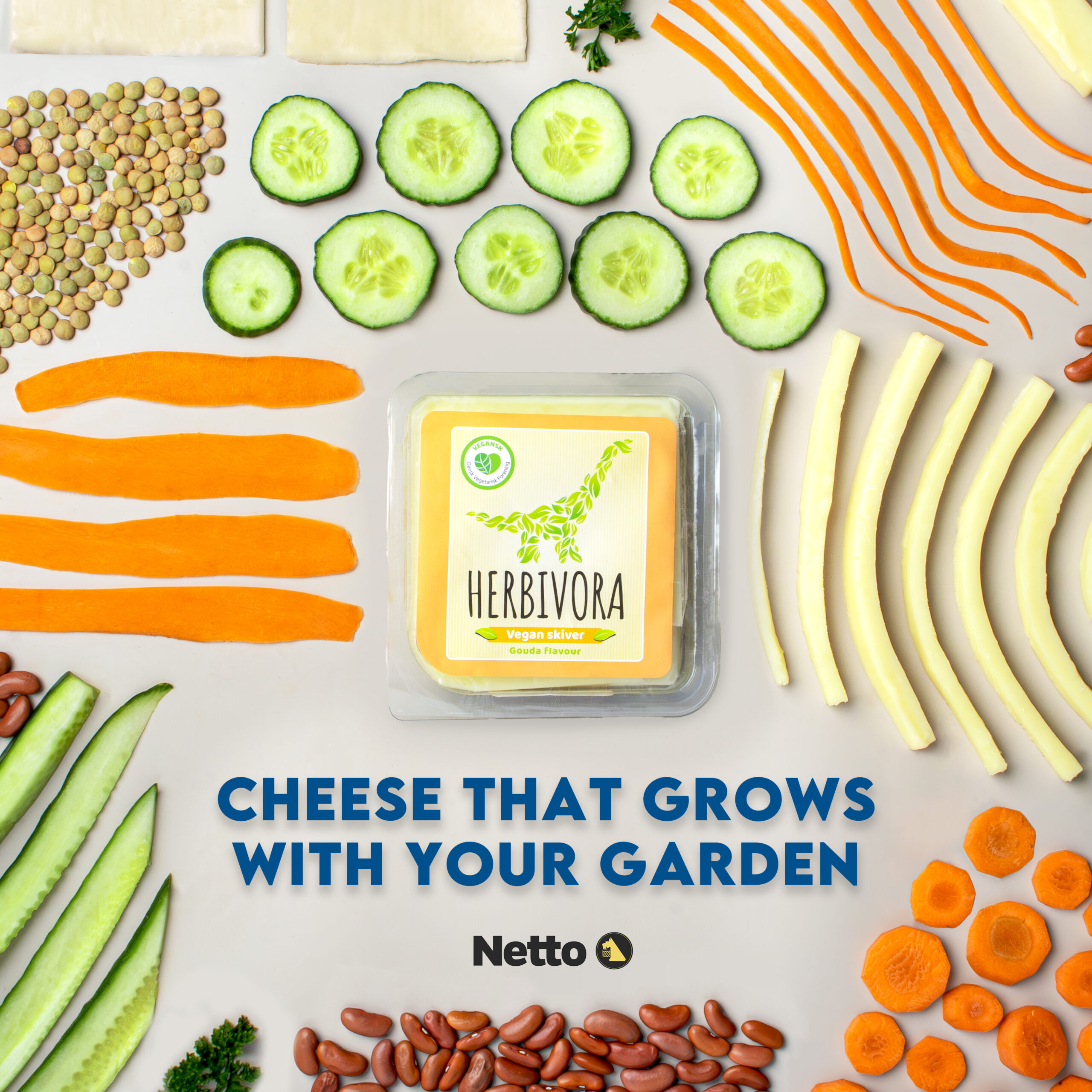
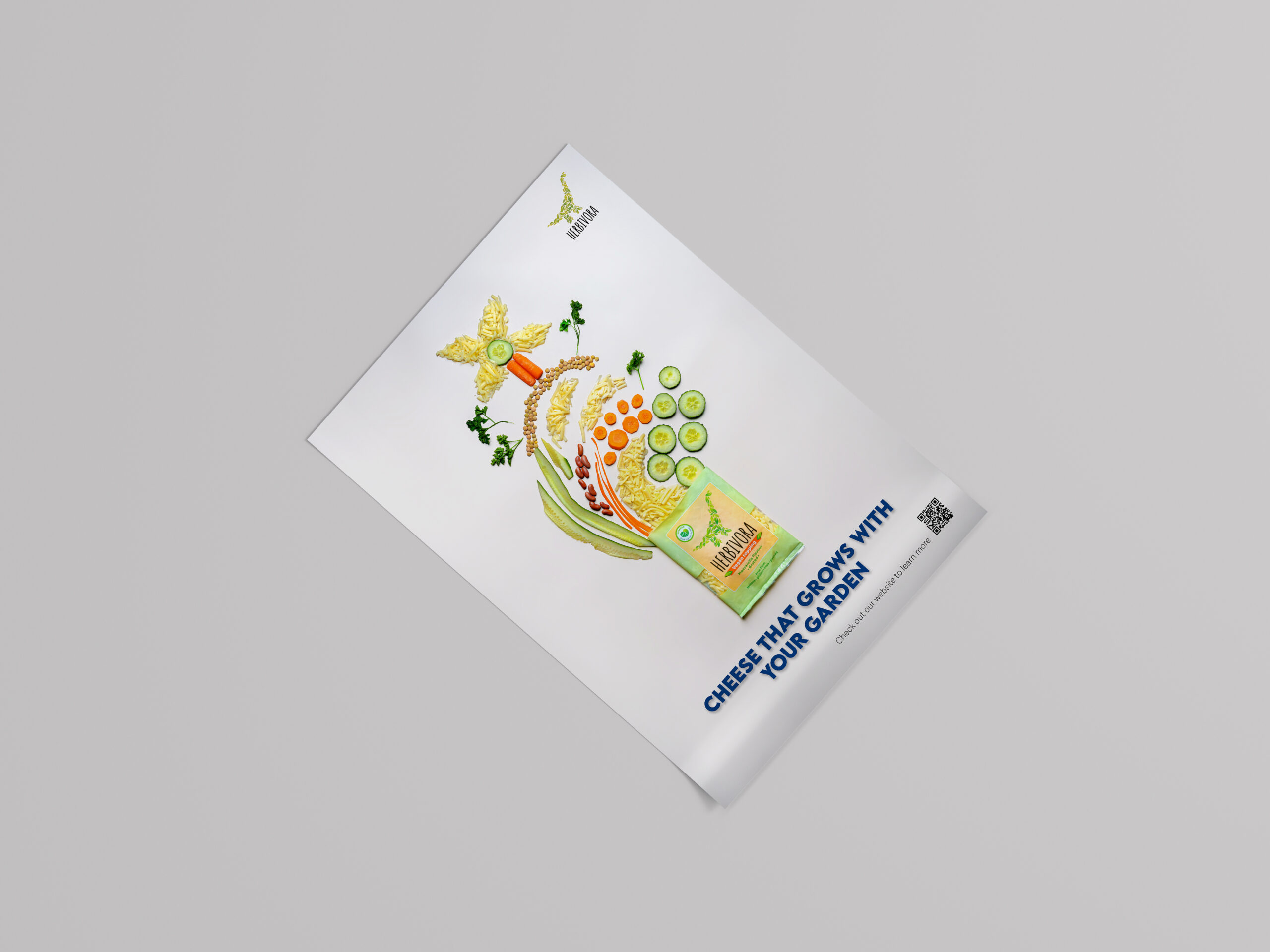
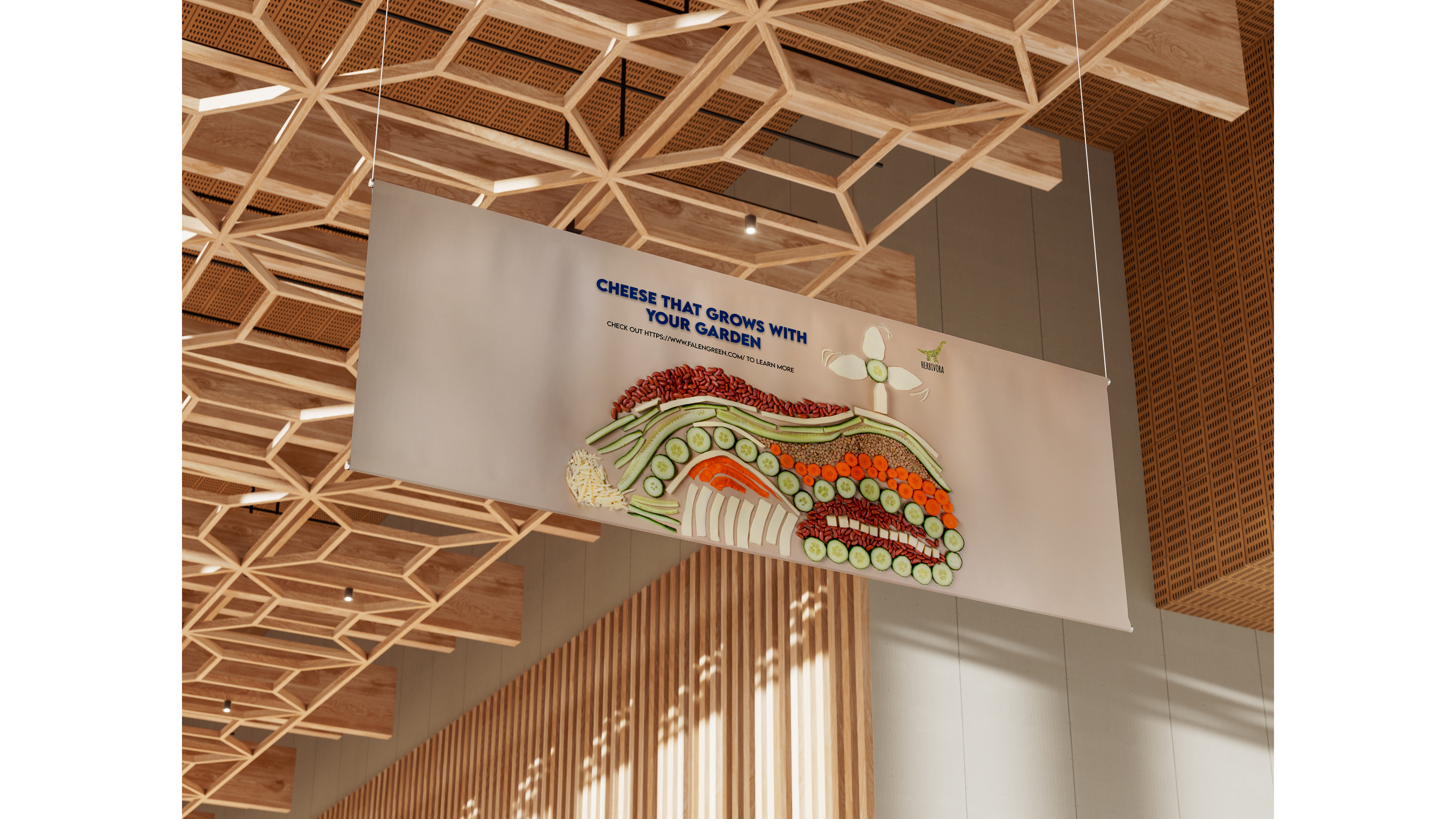
Herbivora Vegan Cheese
Illustrator
Photoshop
I participated in an International Ad Campaign hosted by Humber Polytechnic and Business Academy Aarhus (Denmark). Our team was awarded First Place for this campaign.
Objective:
Position Herbivora as the go-to vegan cheese for sustainability-conscious consumers, proving that plant-based options are accessible, flavourful, and perfect for fresh, eco-friendly meals.
Challenge:
- Limited vegan cheese options in Denmark.
- Breaking misconceptions about taste and versatility.
- Appealing to both dedicated vegans and curious, health-conscious consumers.
Creative Strategy:
- Tone: Clean, uplifting, and nature-inspired.
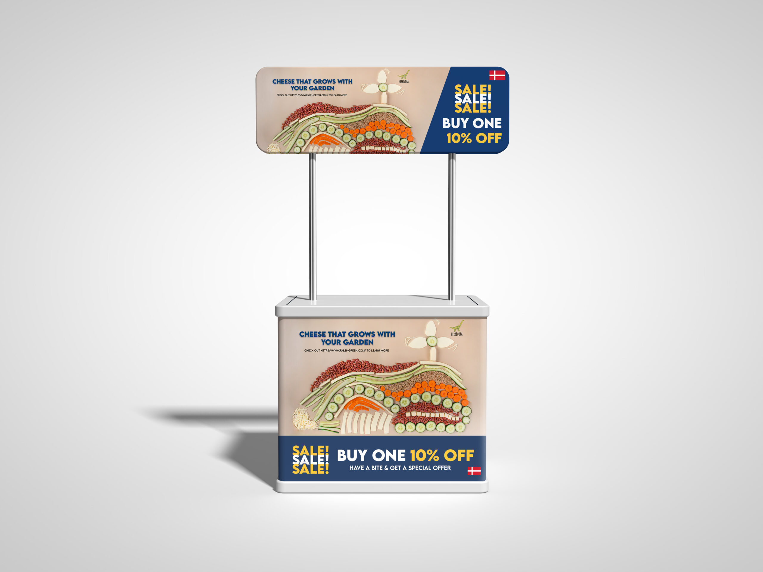
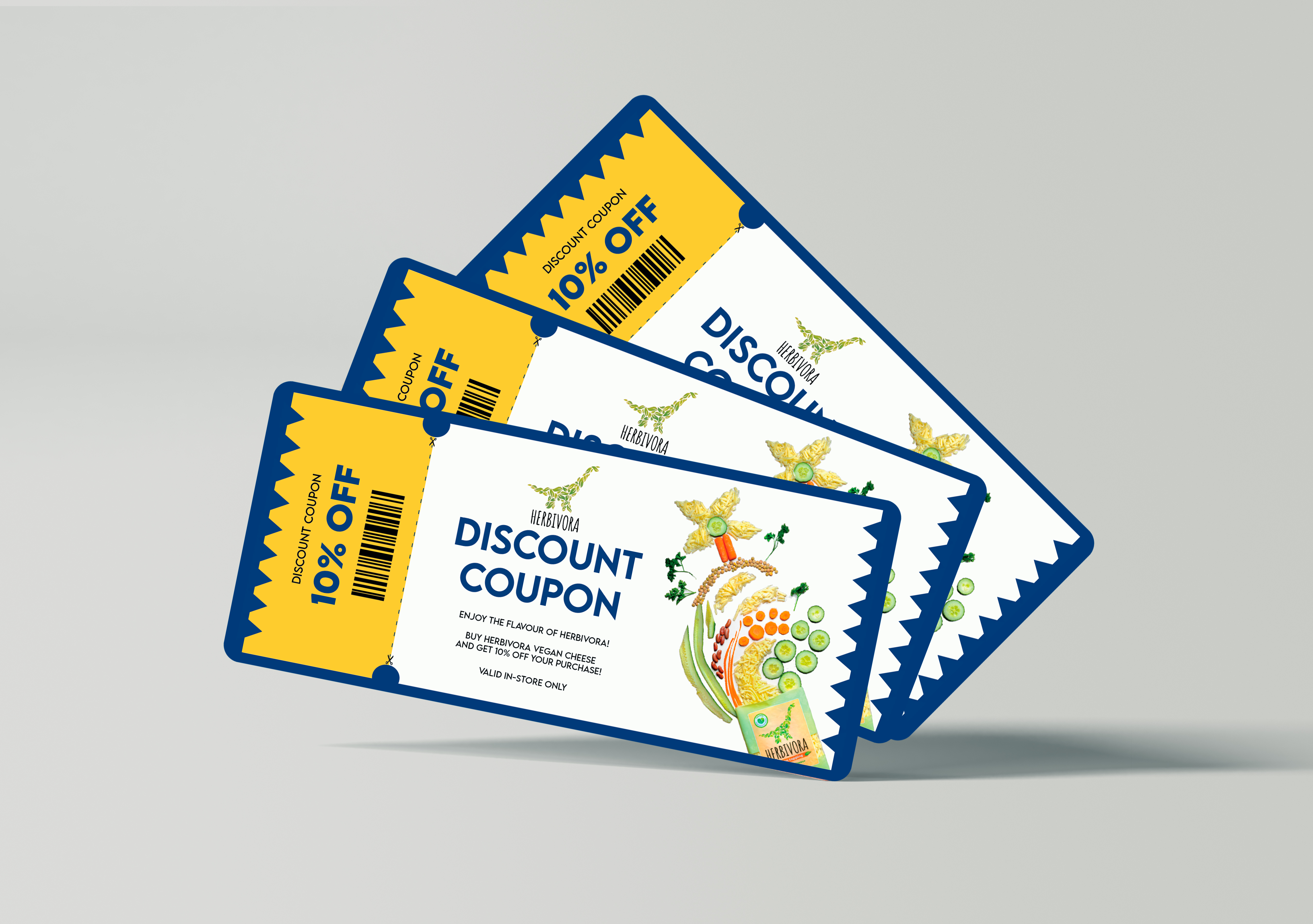
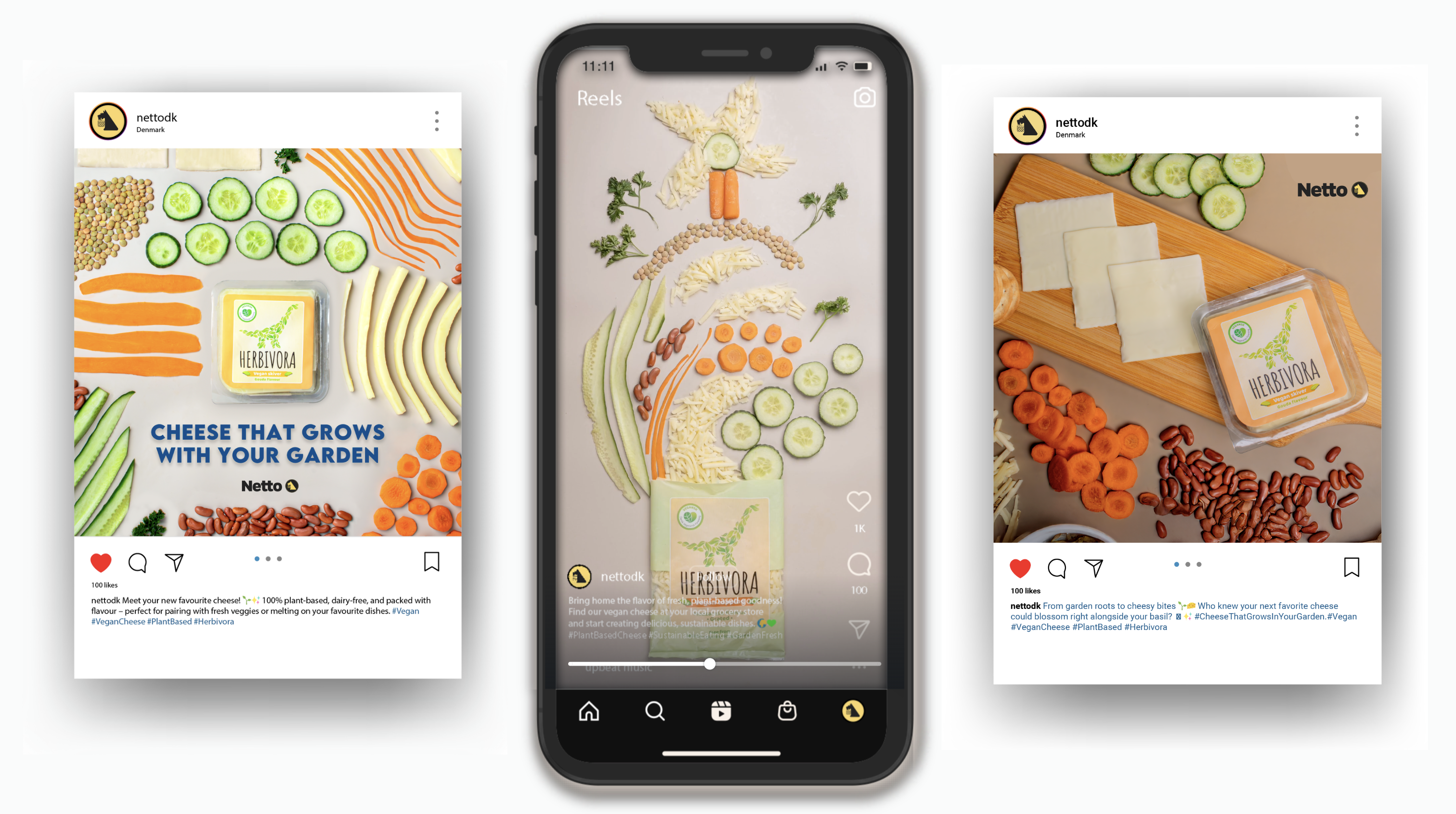
- Big Idea: “Cheese That Grows with Your Garden.”
- Visuals: Fresh, vibrant imagery of Herbivora’s cheese with garden-fresh produce. Wind turbines honour Danish culture, while blooming plants reinforce sustainability and growth.
Flyer
Banner
Tasting Booth Design
Coupon
Social Media Ads
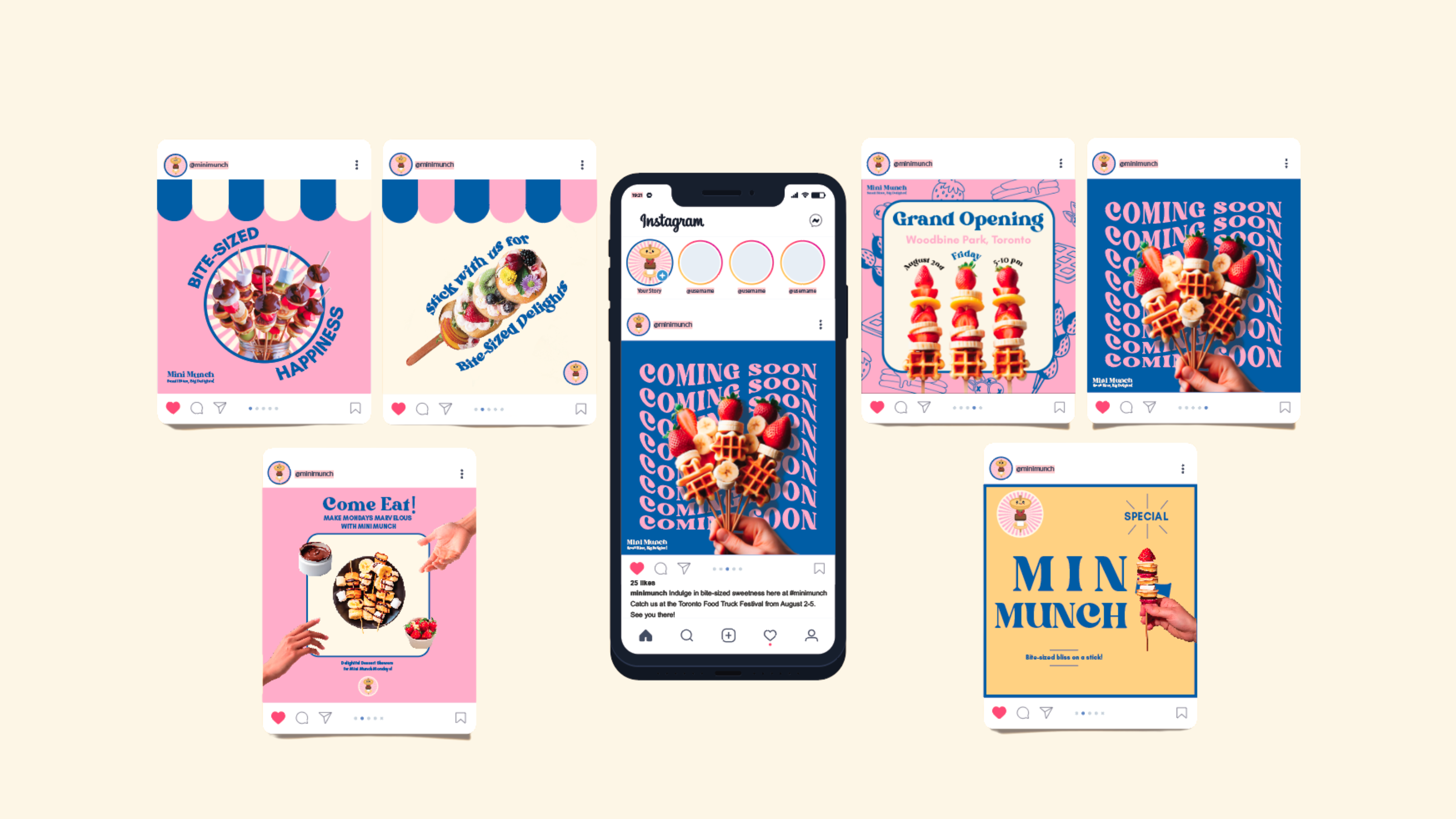
Mini Munch
Illustrator
Indesign
Objective:
Position Mini Munch as the go-to destination for fun, customizable bite-sized treats that bring flavour, creativity, and nostalgia to dessert.
Challenge:
- Stand out by emphasizing playful customization over traditional desserts.
- Appeal to both kids (fun visuals) and parents (quality & portion control).
- Build strong brand recognition with a cute, retro, and approachable identity.
Creative Strategy:
- Tone: Cheerful, light-hearted, and inviting.
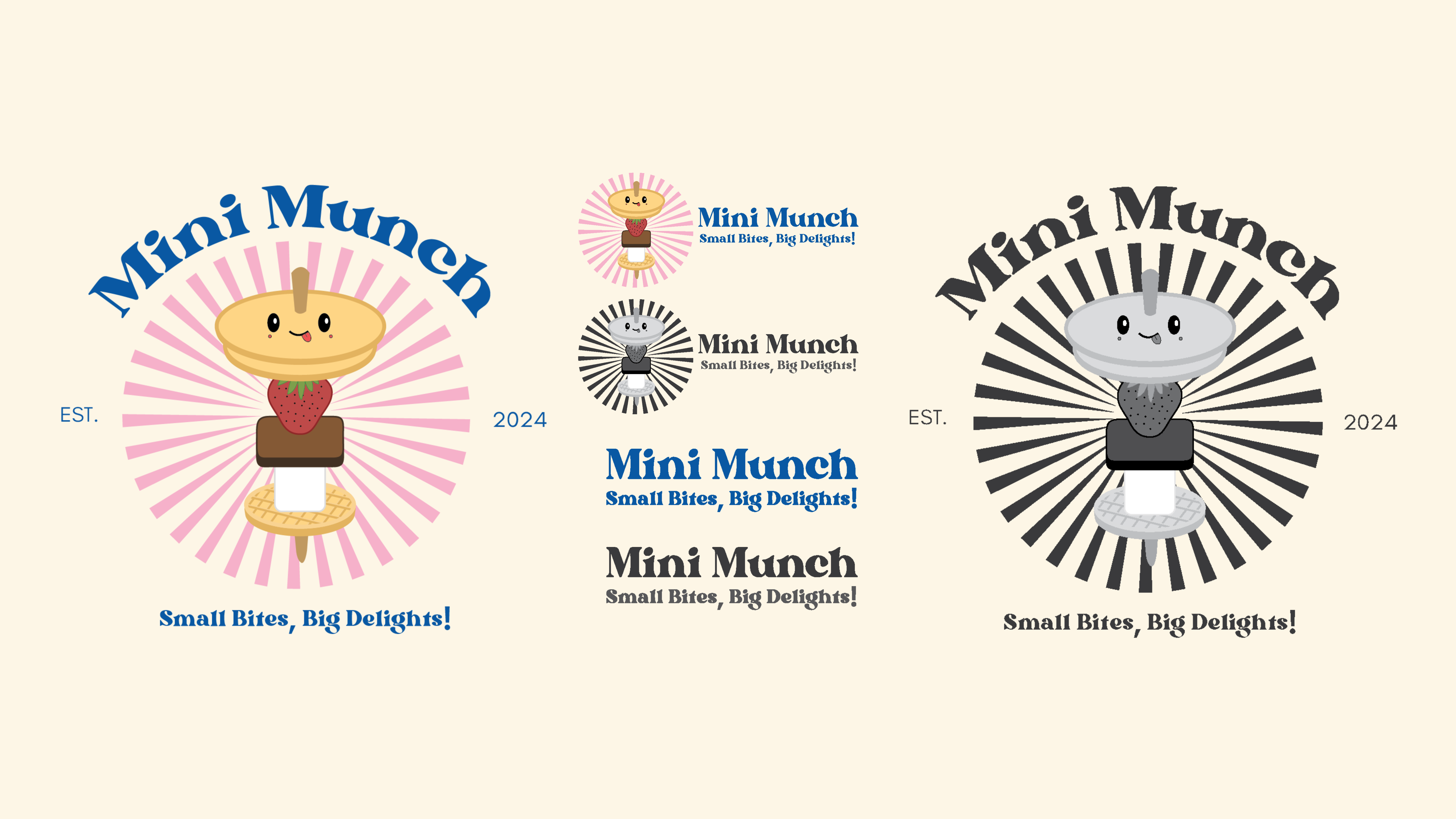
- Big Idea: “Small Bites, Big Delights!”
- Visuals: Pastel, retro-inspired designs with playful fonts and nostalgic diner-style graphics. Eye-catching mini treats stacked, skewered, and drizzled with colourful toppings enhance the fun factor.
Mini Munch Logo
Social Media Ads
Food Truck
Mini Munch Menu
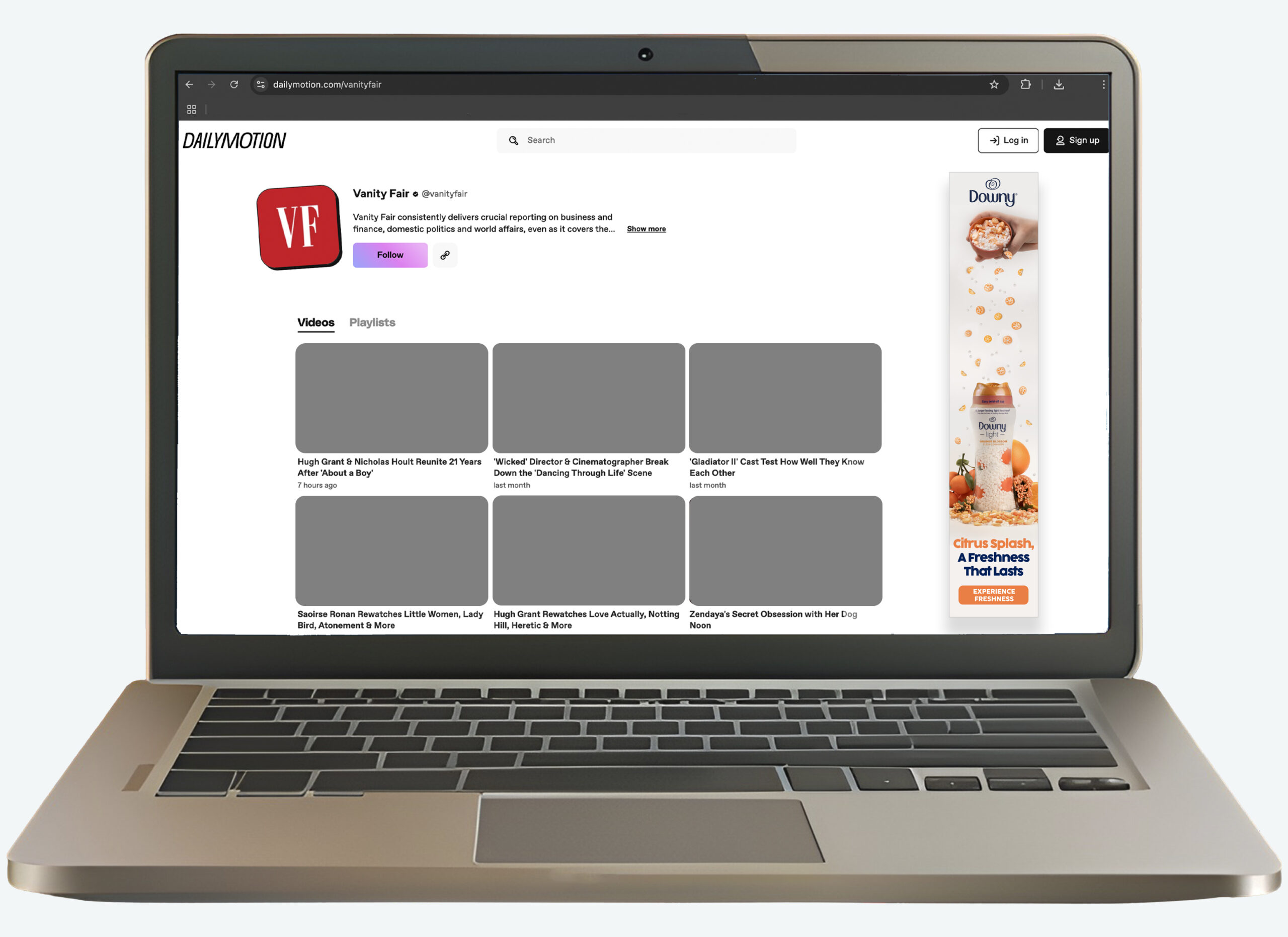
Downy In Wash Scent Booster Beads
Photoshop
Indesign
Objective:
Position Downy In-Wash Scent Booster Beads as a laundry essential, turning every wash into a long-lasting, customizable sensory experience.
Challenge:
- Stand out against major competitors like Gain, Tide, and Febreze.
- Shift scent boosters from a luxury to a must-have.
- Create emotional connections through comforting, fresh scents.
Creative Strategy:
- Big Idea: Emphasizing Downy’s signature freshness.
- Visuals: Clean, bright aesthetics with natural elements like lavender and citrus.
- Tone: Warm, inviting, and sensory-driven, celebrating the joy of fresh laundry.
Billboard
Magazine
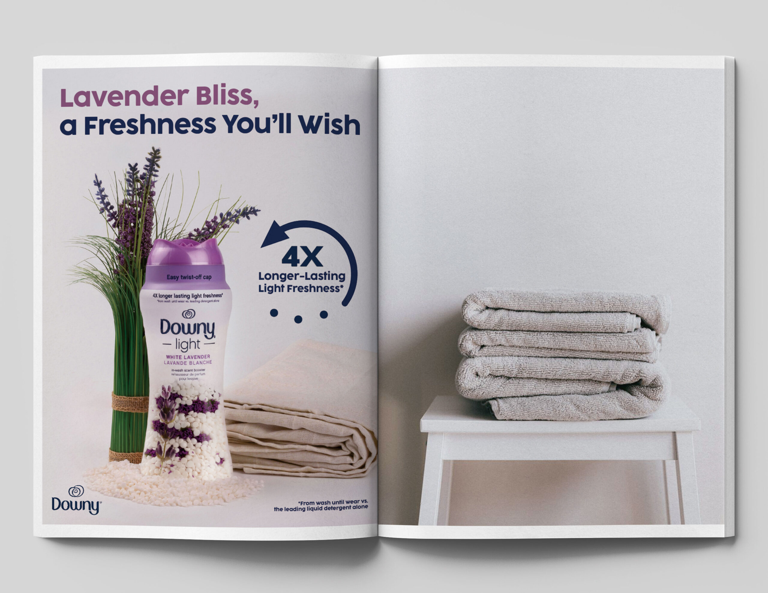
Web Banner
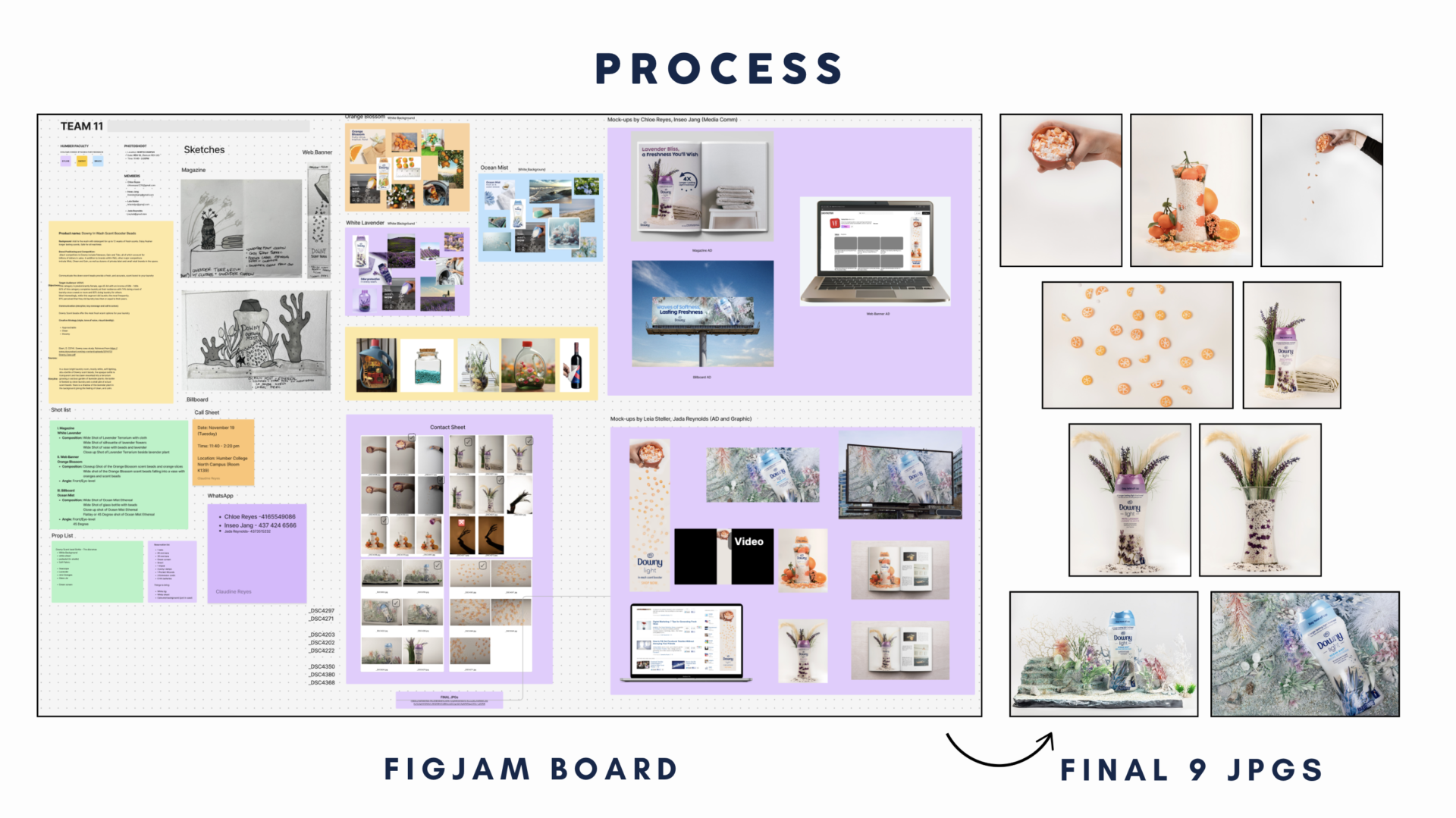
Process
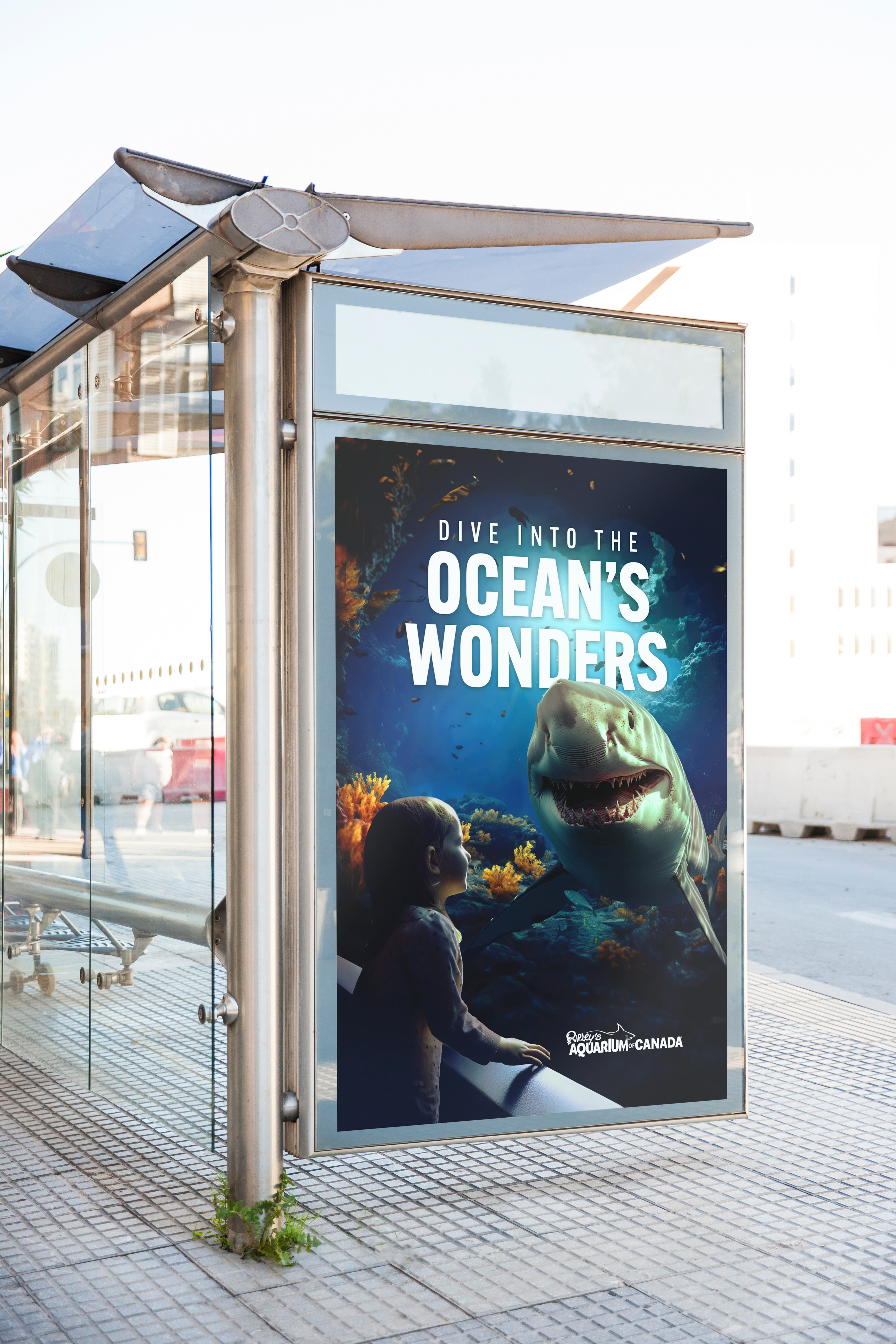
Ripley’s Aquarium
Ad Campaign
Photoshop
Illustrator
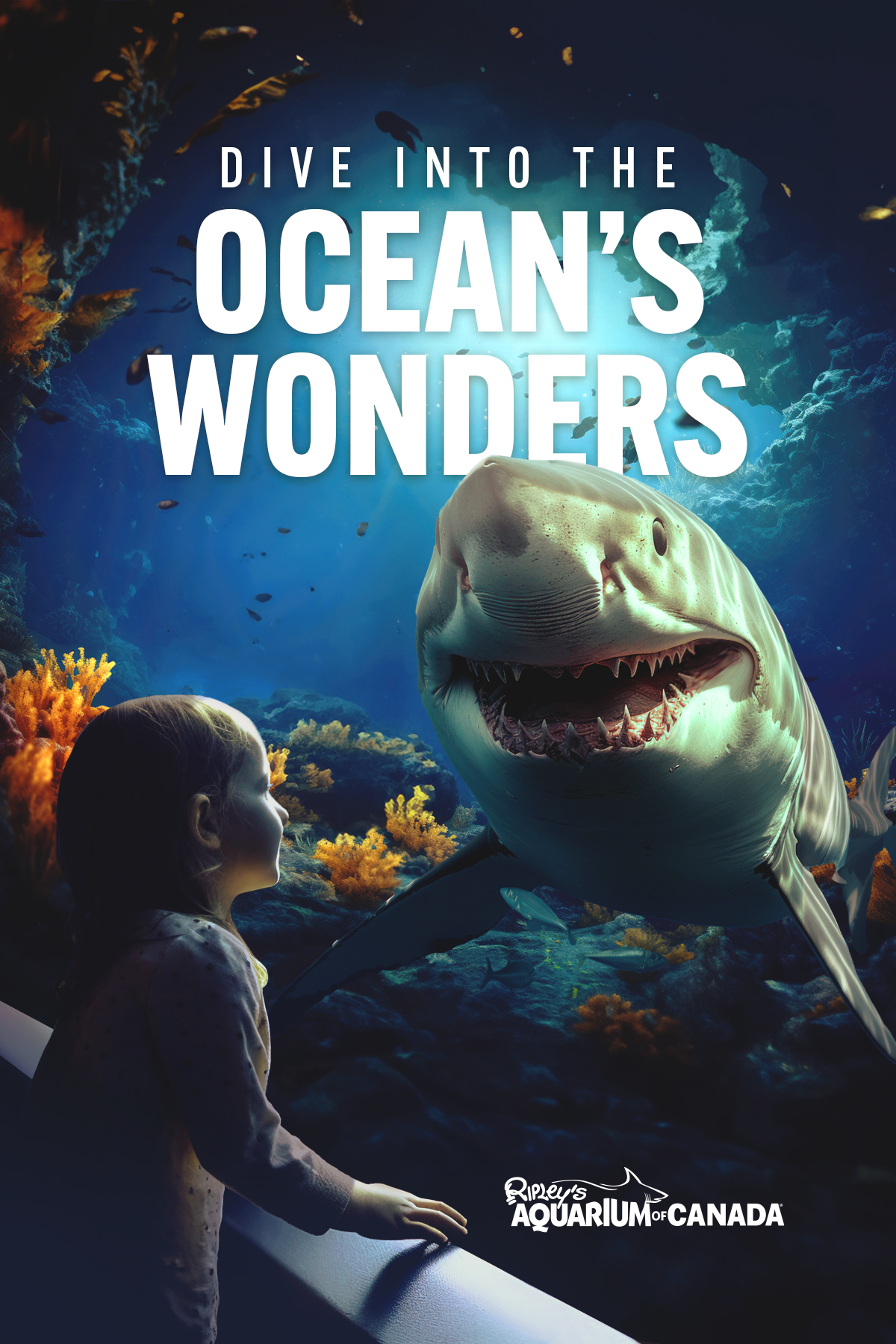
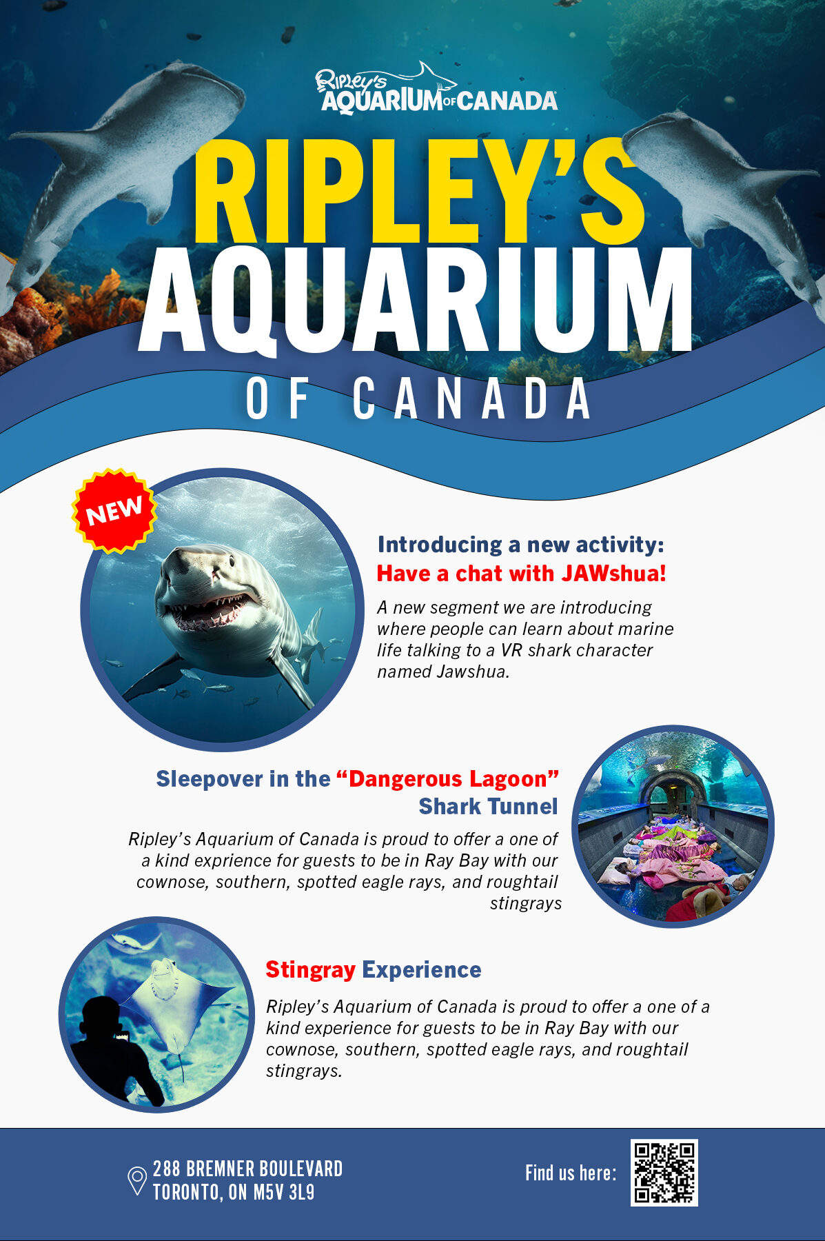
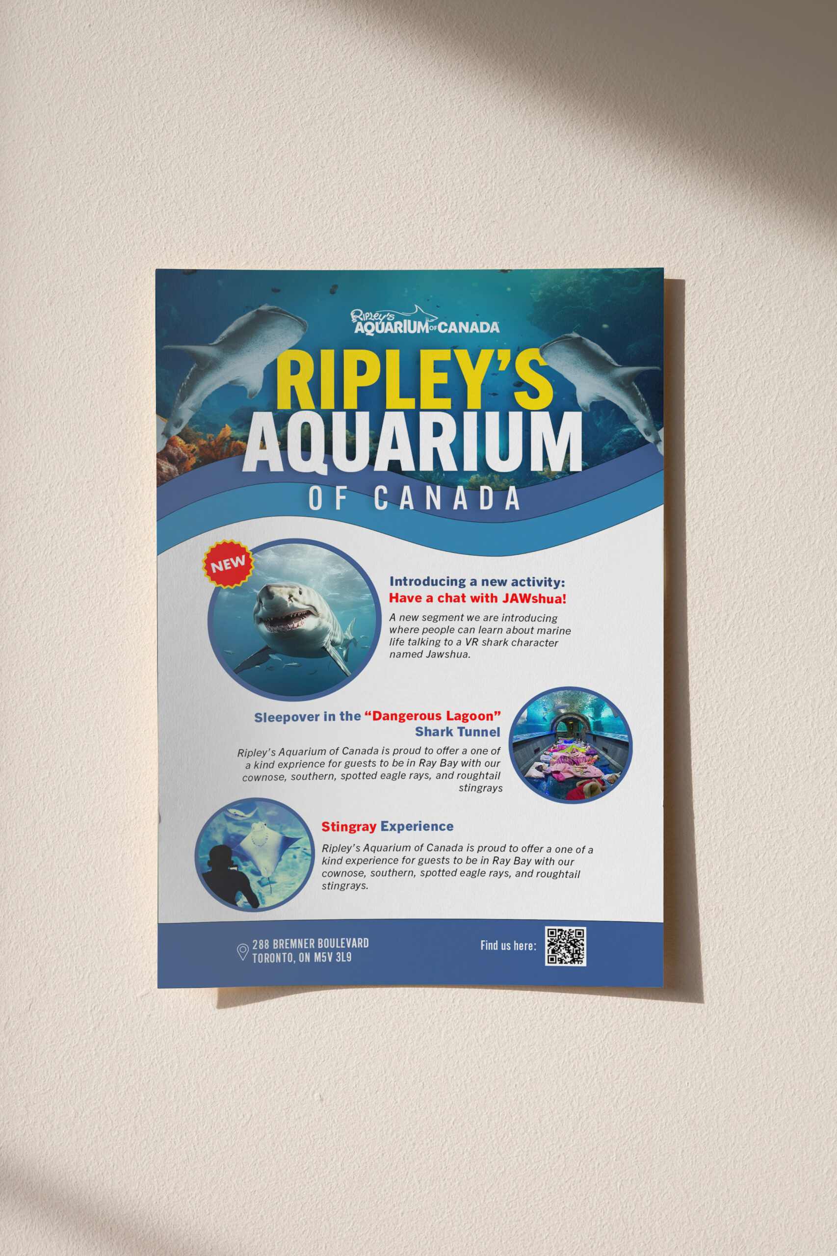
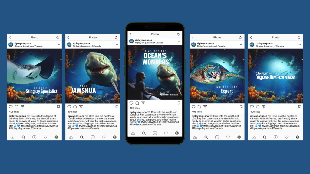
Objective:
Position Ripley’s Aquarium of Canada as a must-visit destination, offering an immersive and educational underwater experience for families.
Challenge:
- Stand out among entertainment and educational attractions.
- Engage families with interactive and visually captivating content.
- Highlight the aquarium’s unique marine life in a fun, memorable way.
Creative Strategy:
- Big Idea: “Dive into the Ocean’s Wonders.”
- Visuals: Vivid underwater scenes featuring engaging characters like JAWshua the friendly shark.
- Tone: Playful, educational, and family-friendly, inspiring curiosity and excitement.
Transit Shelter
Ripley’s Aquarium of Canada Poster
Ad Campaign Flyer
Flyer Mockup
Digital Design
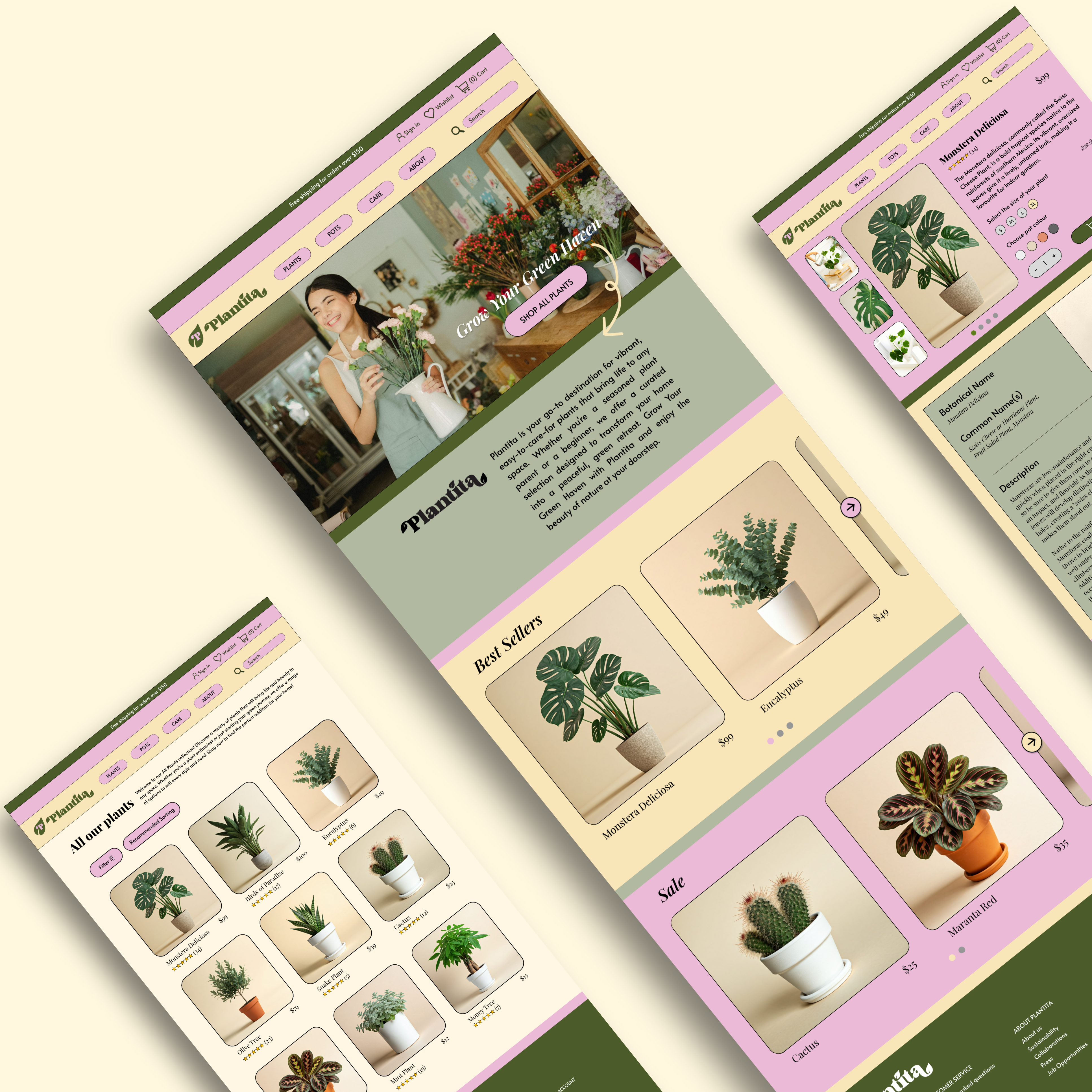
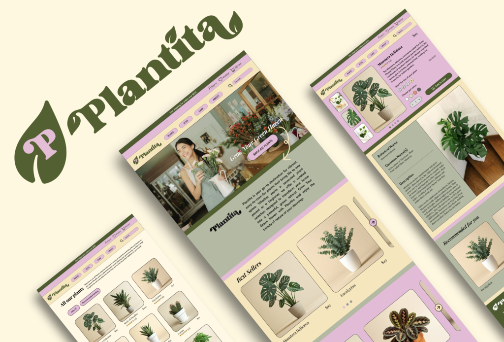
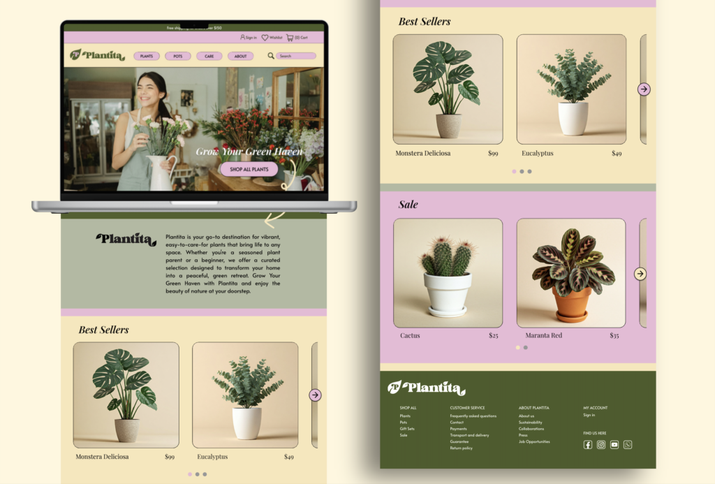
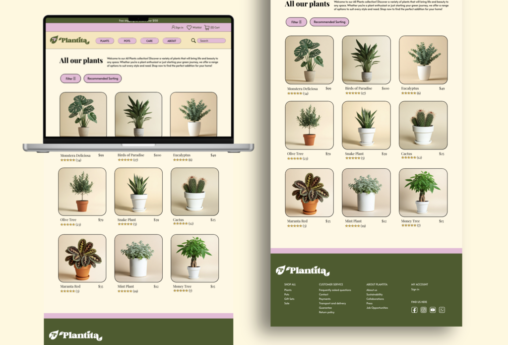
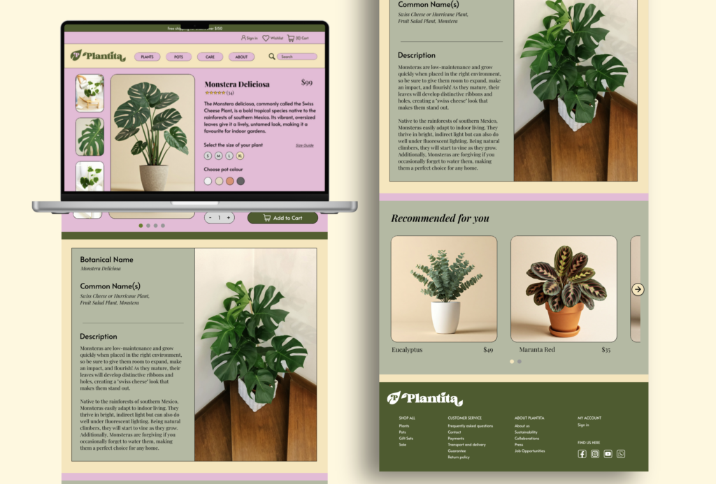
Plantita UX/UI E-commerce Website
Illustrator
WordPress
Figma
Objective:
Establish Plantita as a go-to destination for modern plant lovers by offering a seamless, visually engaging online shopping experience for stylish greenery and plant care essentials.
Challenge:
- Stand out in a saturated market of plant and lifestyle brands.
- Build an e-commerce platform that is both aesthetically pleasing and user-friendly across all devices.
Creative Strategy:
- Visuals: A clean, modern logo paired with a calming, nature-inspired visual identity. Earthy tones and soft, leafy motifs guide the aesthetic.
- Tone: Fresh, minimalist, and nurturing—inviting plant parents to build their own indoor oasis.
Execution:
- Designed the logo and complete visual identity of Plantita.
- Prototyped a fully responsive e-commerce website using Figma:
- Desktop: https://tinyurl.com/338cwhjv
- Mobile: https://tinyurl.com/ckajnk7f
- Brought it to life as a custom-built WordPress site: claudinereyes.com/customtheme/
French Bulldog Infographic & Animation
Illustrator
Aftereffects
I created an informative infographic highlighting interesting facts about French Bulldogs, covering details about their history, temperament, and unique characteristics. Later, I transformed this static design into an engaging animation video, visually presenting these facts in a more dynamic and interactive way to make the information more entertaining and accessible.
Storyboard
Print Design
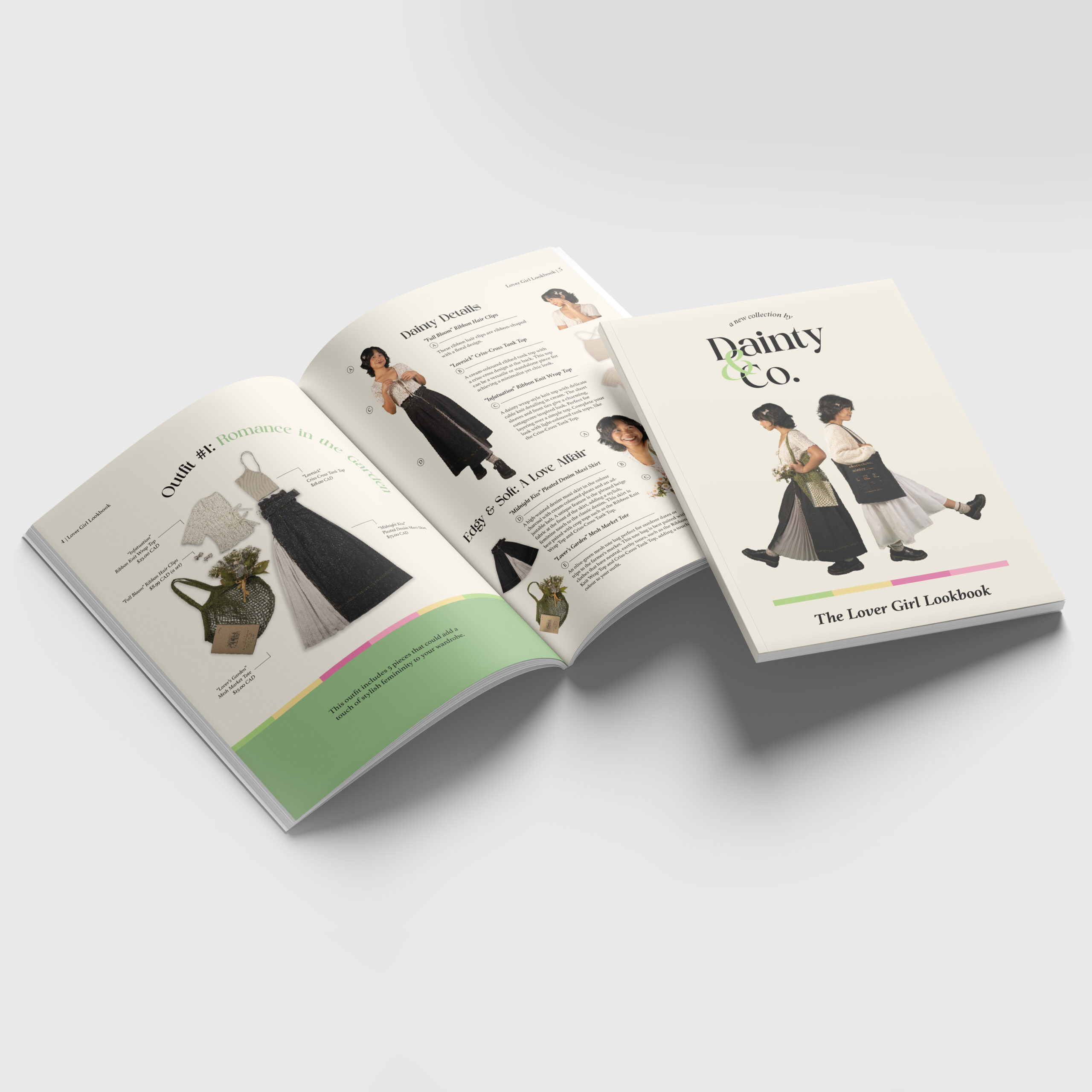
Fashion Booklet: Dainty & Co.
Illustrator
Indesign
Objective:
Position Dainty & Co.’s Lover Girl Lookbook as a go-to style guide for soft, romantic fashion lovers seeking confidence, charm, and main-character energy through clothing.
Challenge:
- Blend two trending aesthetics—Soft Girl and Cottagecore—into a cohesive, wearable collection.
- Present a fictional fashion brand with a polished, editorial-style lookbook.
- Inspire audiences to explore their own personal style through storytelling and visuals.
Creative Strategy:
- Big Idea: “Embrace Your Inner Lover Girl”
- Visuals: Dreamy pastel tones and muted earthy palettes frame each outfit. Styled flat-lays, romantic poses, and soft lighting convey a delicate, storybook charm.
- Tone: Whimsical, empowering, and gently nostalgic—designed to awaken the inner romantic and encourage expressive self-styling.
- Execution: Curated and designed the Lover Girl Lookbook for Dainty & Co., featuring 2 complete outfits composed of 4–5 statement pieces each. The visual guide captures the essence of Soft Girl and Cottagecore aesthetics, helping audiences discover a style that feels both confident and effortlessly chic.
The Memory Police Book Cover
Photoshop
Indesign
Objective:
Reimagine the cover of The Memory Police to visually convey the novel’s themes of memory loss, disappearance, and emotional isolation, while capturing the interest of new readers.
Challenge:
- Maintain a connection to the original cover while introducing a more evocative and modernized look.
- Reflect the book’s somber, thought-provoking tone through imagery and color.
Creative Strategy:
- Visuals: A surreal portrait of a woman’s face partially obscured by dissolving flowers, symbolizing the fragmentation and loss of memory. The use of real photographic textures adds emotional depth and realism.
- Tone: Mysterious, melancholic, and contemplative—mirroring the novel’s atmosphere of quiet dystopia.
- Execution: Redesigned the book cover using the original color palette with desaturated tones to match the story’s serious mood. Combined real-life imagery with symbolic elements to offer a haunting visual narrative that invites curiosity and emotional connection.
Images used:
Painting
Birds painting
Blindfolded woman with flowers
Before-and-After:
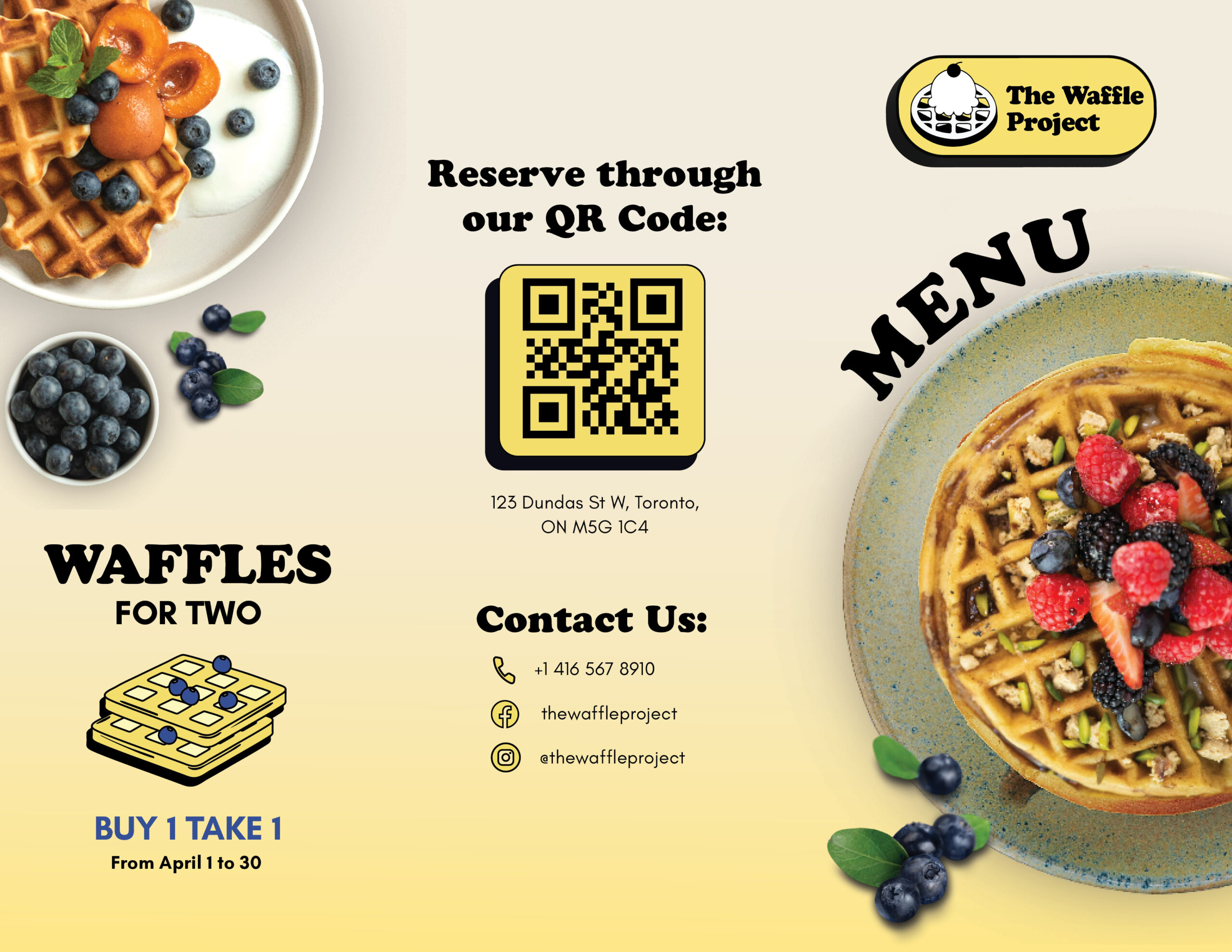
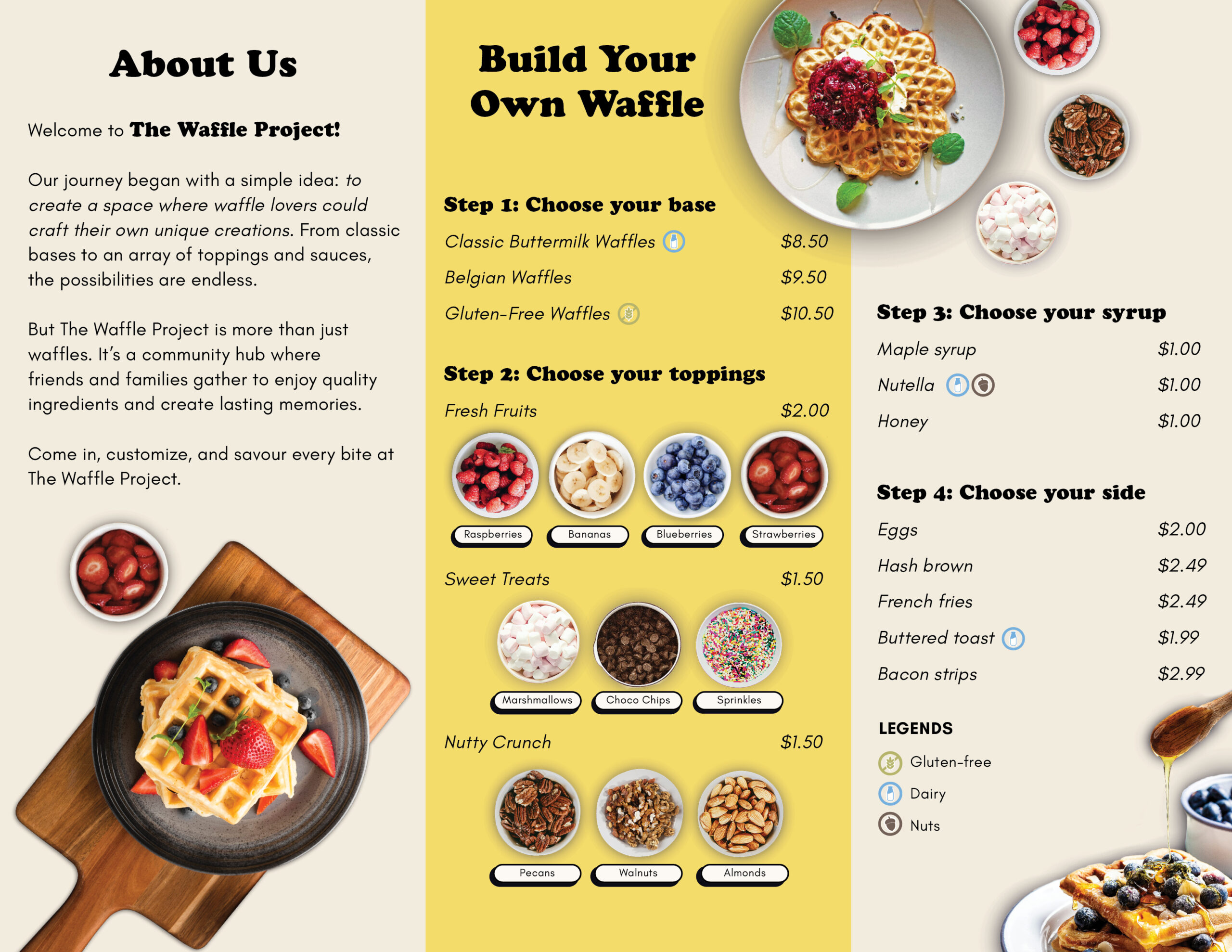
The Waffle Project Trifold Brochure
Photoshop
Indesign
Illustrator
Objective:
Promote The Waffle Project as a fun, customizable dining experience focused on build-your-own waffles.
Challenge:
- Make a fictional brand feel real and appetizing.
- Communicate the ordering process clearly within a small brochure format.
Creative Strategy:
- Big Idea: Build your own waffle
- Visuals: Bright, tempting food photography and clean step-by-step icons.
- Tone: Playful, modern, and indulgent.
- Execution: Designed a trifold brochure featuring an About Us section, menu, customization guide, promo, contact info, and a reservation QR code—presented with vibrant, engaging visuals to attract hungry customers.
Outside
Inside
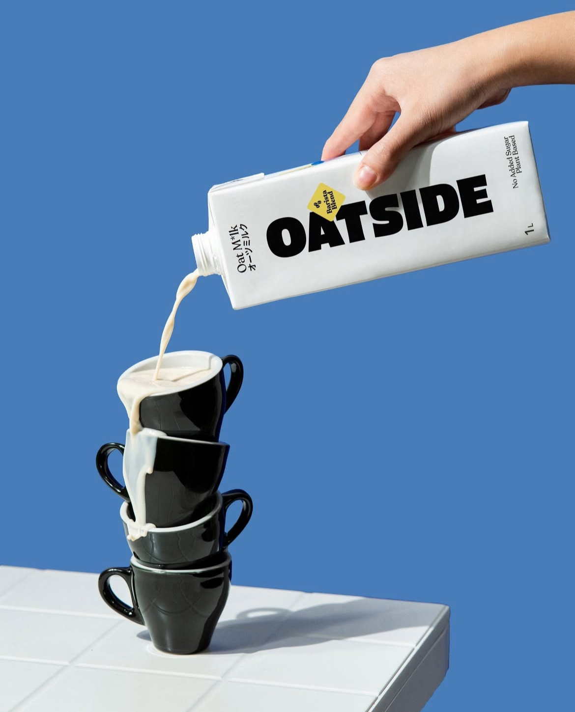
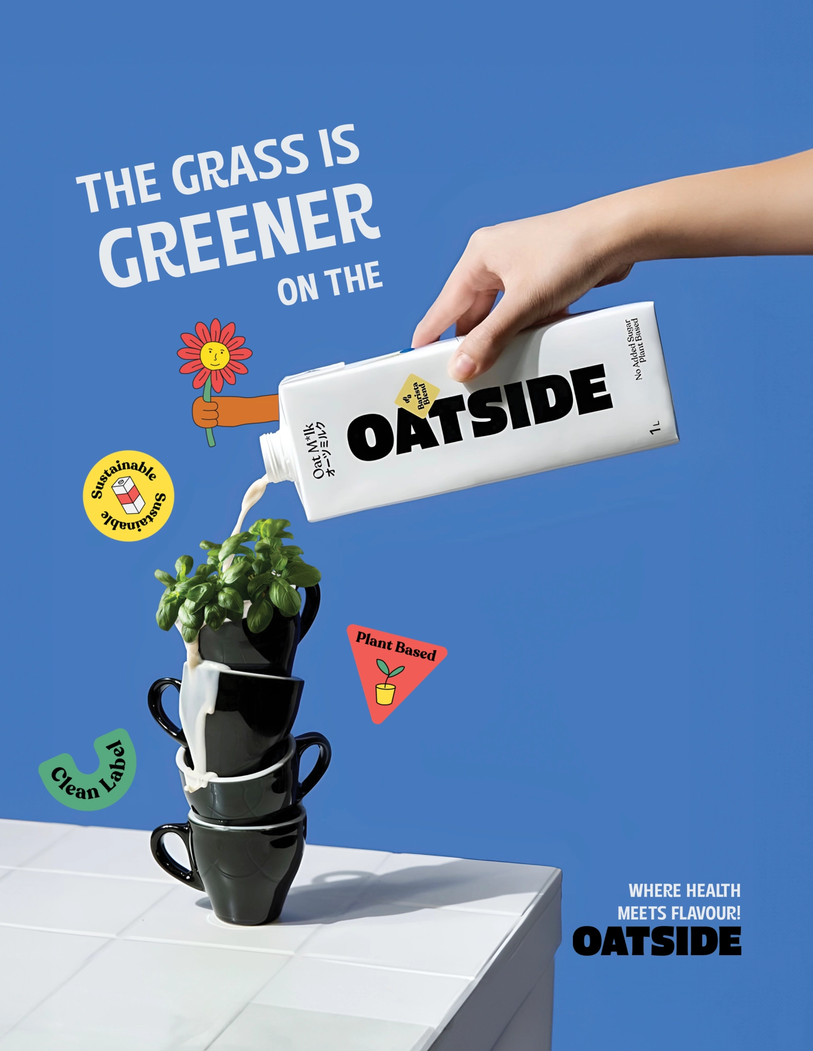
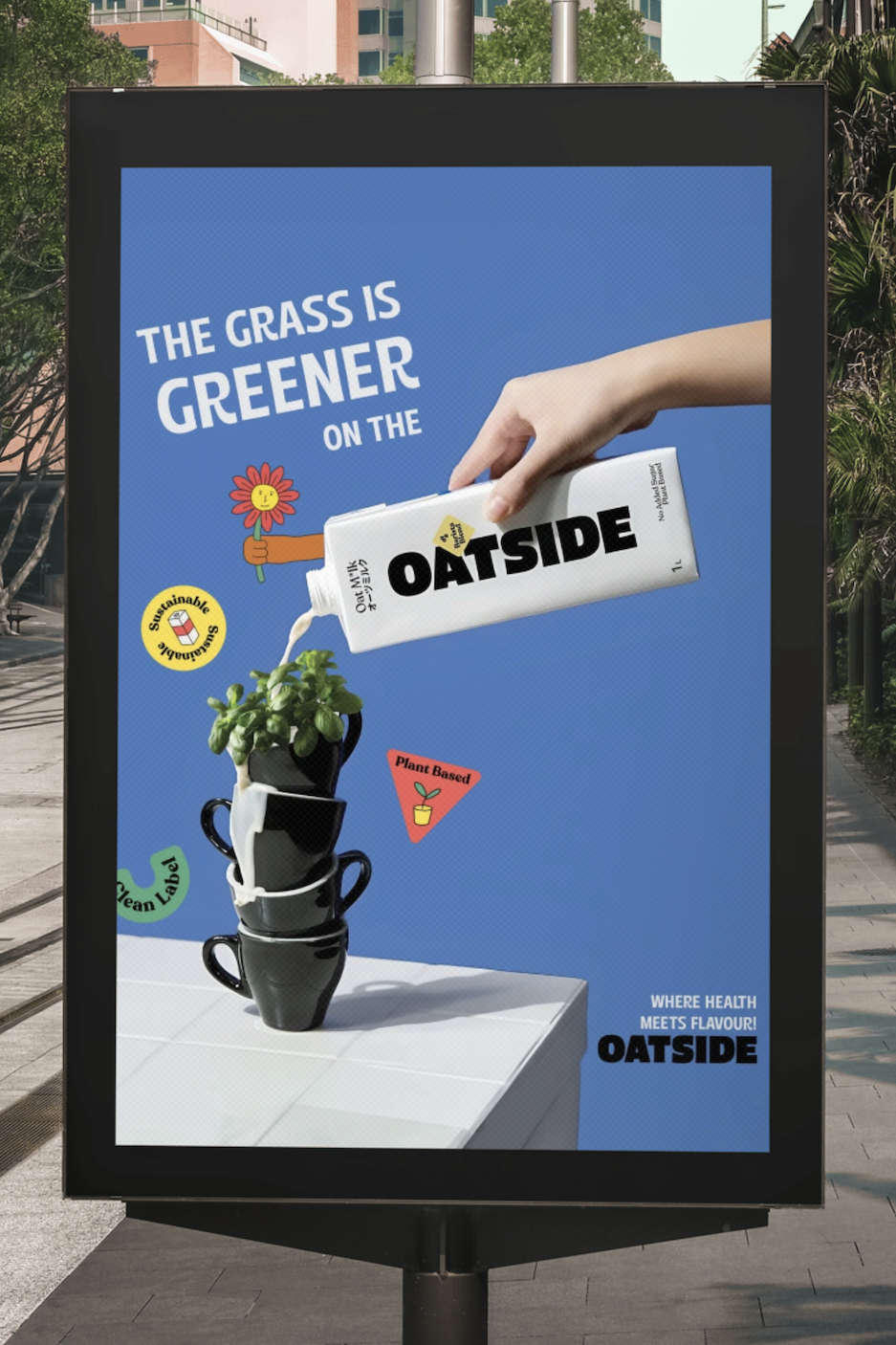
Oatside
Photoshop
Illustrator
Objective:
Promote Oatside as a sustainable, plant-based milk alternative that’s both healthy and flavorful.
Challenge:
- Visually convey eco-friendliness and modern appeal.
- Highlight health benefits while standing out from other non-dairy brands.
Creative Strategy:
- Big Idea: “The grass is greener on the Oatside.”
- Visuals: Oat milk poured over stacked black cups topped with a plant, set against a bright blue backdrop for a fresh, modern look.
- Tone: Clean, bold, and eco-conscious.
- Execution: Designed an ad featuring the tagline and supportive icons like “Sustainable” and “Plant-Based,” with a closing line that ties it all together: “Where health meets flavour!”